Black Pearl Redesign
The Black Pearl Redesign was a 7-week individual project focused on reimagining the restaurant’s digital presence through a responsive website and mobile design.
UI/UX
Redesign

Project Overview
Timeline: August- October 2025 (7 weeks)
Your role: UX Designer / Researcher / Visual Designer
Team setup: Individual project | SI407: Advanced Design
Tools used: Figma, Miro
The Black Pearl Redesign was a 7-week individual project focused on reimagining the restaurant’s digital presence through a responsive website and mobile design. As the UX Designer and Visual Designer, I led the full process from research and ideation to high-fidelity prototyping and usability testing using Figma and Miro as my main tools.
The Goal
My goal for this project was to modernize Black Pearl’s website so that it reflects the upscale, polished dining experience the restaurant is known for in downtown Ann Arbor. While the original site allowed users to perform basic actions like viewing the menu and booking reservations, its heavy reliance on centered text, lack of visual hierarchy, and generic imagery made it difficult to scan and disconnected from the restaurant’s brand identity. My focus was to enhance usability, structure, and aesthetics while maintaining the restaurant’s authentic character.
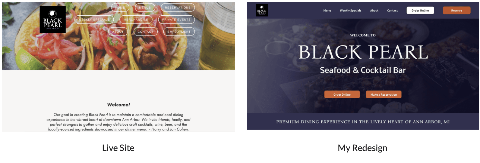
First Glance Comparison
Problem Definition
At first glance, Black Pearl’s website appeared simple, functional, but not memorable. It lacked storytelling, visual consistency, and brand differentiation, making it easy for potential customers to overlook it when comparing options for upscale dining.
Core Issues Identified:
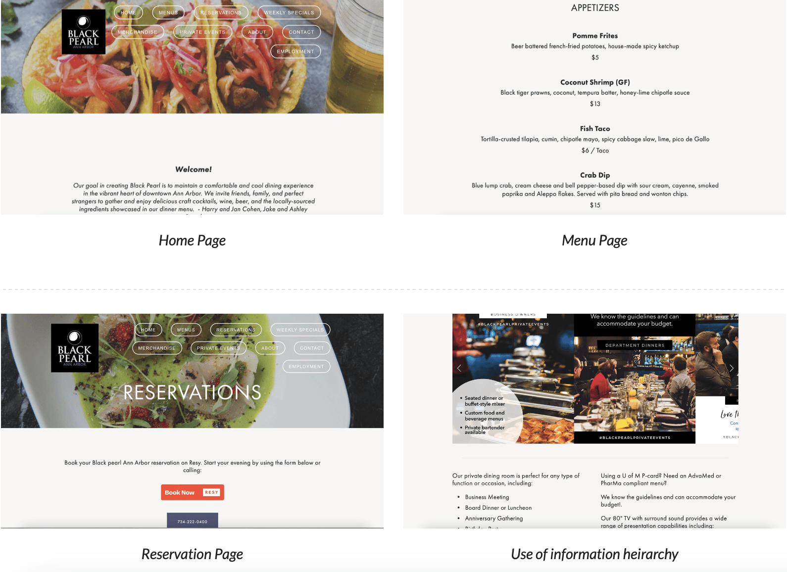
Centered text and limited color usage made navigation and scanning difficult.
The minimal design bordered on bland, failing to capture the restaurant’s unique ambiance.
Users had to scroll through long, text-heavy lists to find information, leading to choice overload.
The website didn’t visually match the sophisticated, high-quality dining experience users expected.
I aimed to bridge this gap by improving the information hierarchy and visual storytelling, ensuring that key actions like making a reservation or viewing the menu were immediately visible and enticing.
Screenshots of Black Pearl's Live Site - October 2025
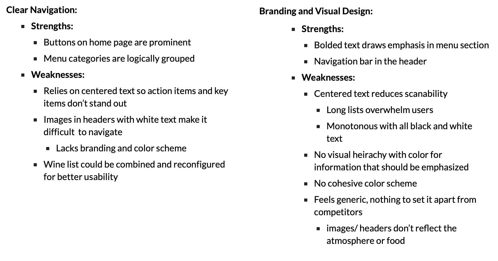
Heuristic Evaluation
Research Process
To understand how users interacted with restaurant websites and what they valued most, I conducted a heuristic evaluation and gathered user data based on observation and contextual analysis.
By combining these insights with competitor analysis with other local restaurants like Real Seafood Co., I confirmed that Black Pearl’s digital experience was underselling its in-person experience.
Research Insights:
User Goals
Make a reservation, view the menu, or order online.
Find basic details quickly (hours, contact info, location).
Gauge the atmosphere and accommodations Black Pearl offers
User Frustrations
Hard to visualize food or navigate long text lists.
Lack of engaging visuals reduced motivation to browse.
The site didn’t reflect the upscale nature of the restaurant.
May be difficult to visualize or quickly view menu, site is very text reliant, choice overload with long lists
Site is not elevated to reflect dining experience, may cause mismatched expectations
Behavioral Insights
Users often skim, seeking quick access to relevant info like hours and specials.
A text-heavy layout causes disengagement.
Strong visuals or clear CTA buttons increase trust and time on site.
May briefly scroll through and become disinterested in the menu format, this could be addressed through reformatting the menu into a traditional style (columns) to split up information more effectively
All text is centered and in black and white in paragraphs and, can utilize color more intentionally to showcase action items and important information (hours, deals, reservations)
User Mindset
Users often skim, seeking quick access to relevant info like hours and specials.
A text-heavy layout causes disengagement.
Strong visuals or clear CTA buttons increase trust and time on site.
May briefly scroll through and become disinterested in the menu format, this could be addressed through reformatting the menu into a traditional style (columns) to split up information more effectively
All text is centered and in black and white in paragraphs and, can utilize color more intentionally to showcase action items and important information (hours, deals, reservations)
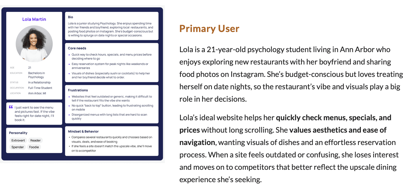
User Personas
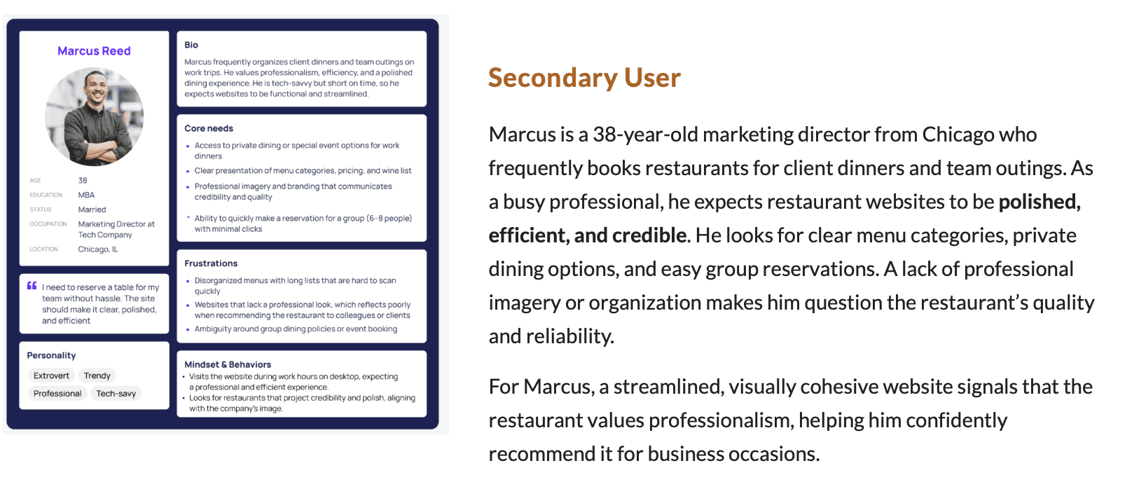
Because Black Pearl attracts a wide range of diners, from students and couples to professionals and tourists, it was challenging to design for such a broad audience without losing focus. Developing 2 personas like Lola and Marcus helped me narrow the project scope by visualizing specific user motivations, frustrations, and behaviors. Lola represented younger, experience-driven diners who prioritize visuals, atmosphere, and ease of access, while Marcus reflected the professional demographic seeking efficiency and credibility for business occasions.
By grounding my design decisions in their needs, I could focus on improving clarity, usability, and brand storytelling, rather than trying to satisfy every potential visitor. These personas guided choices such as emphasizing visual hierarchy, simplifying navigation, and showcasing imagery that communicates both the upscale yet welcoming nature of the restaurant.
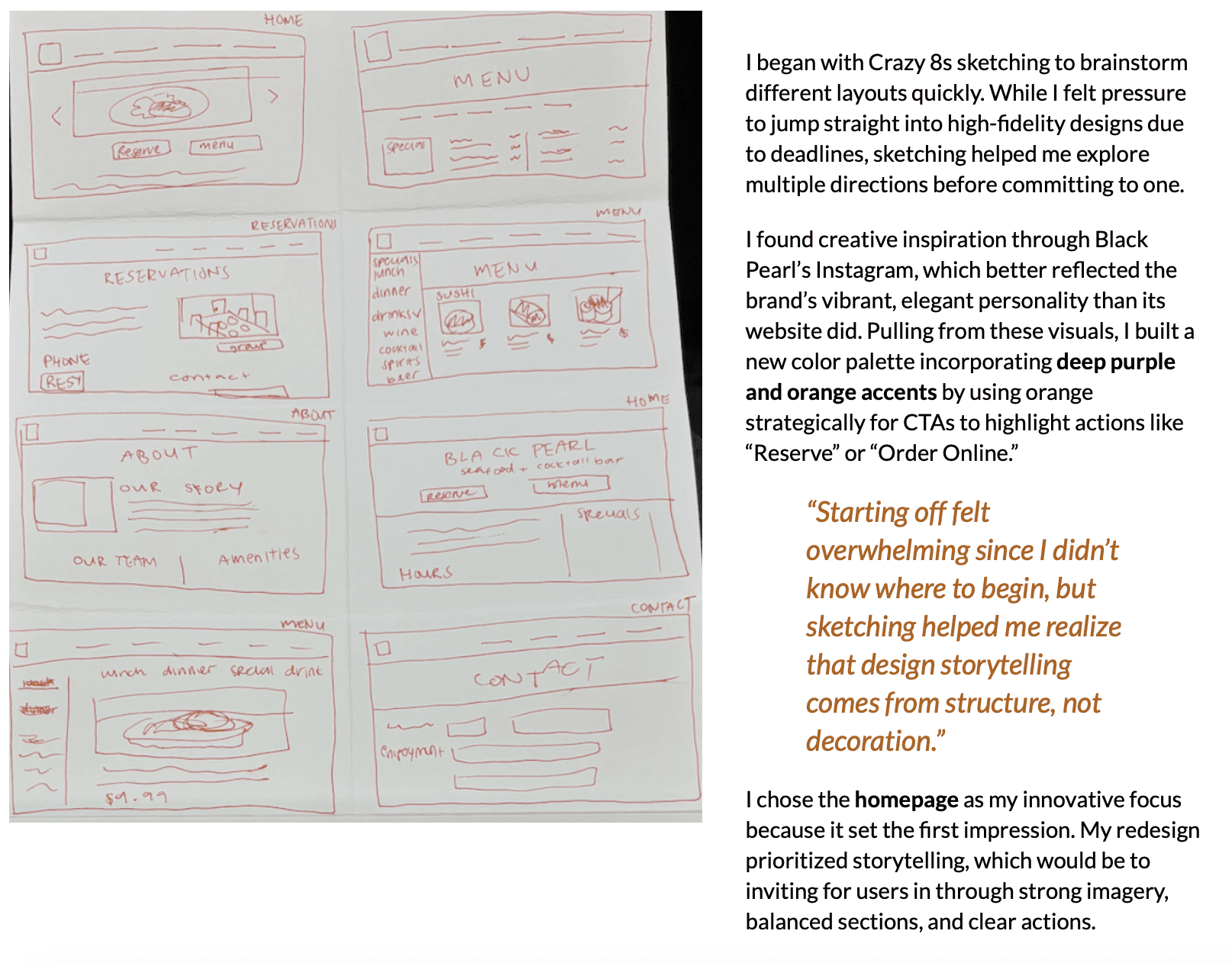
Ideation & Sketches
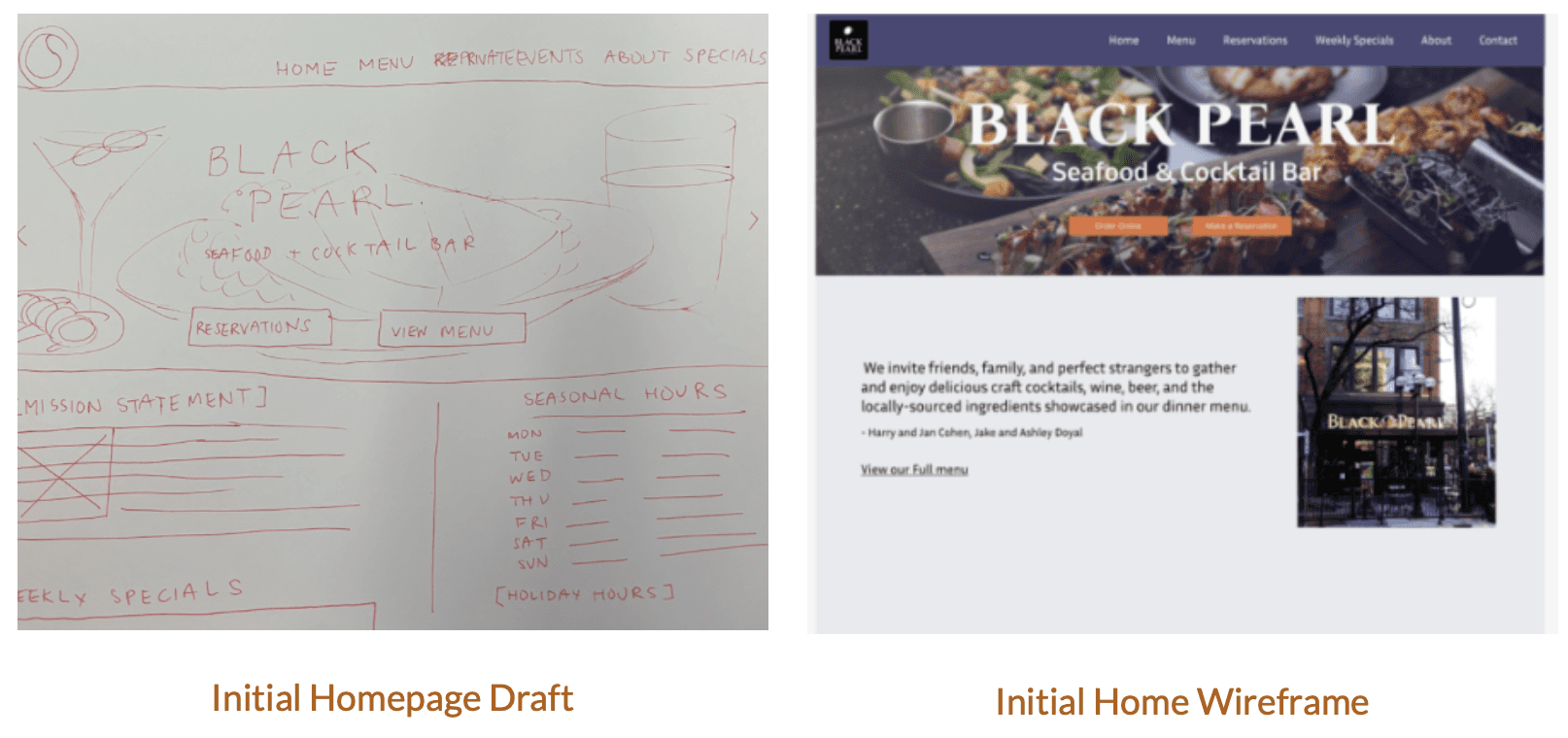
Wireframes & Architecture
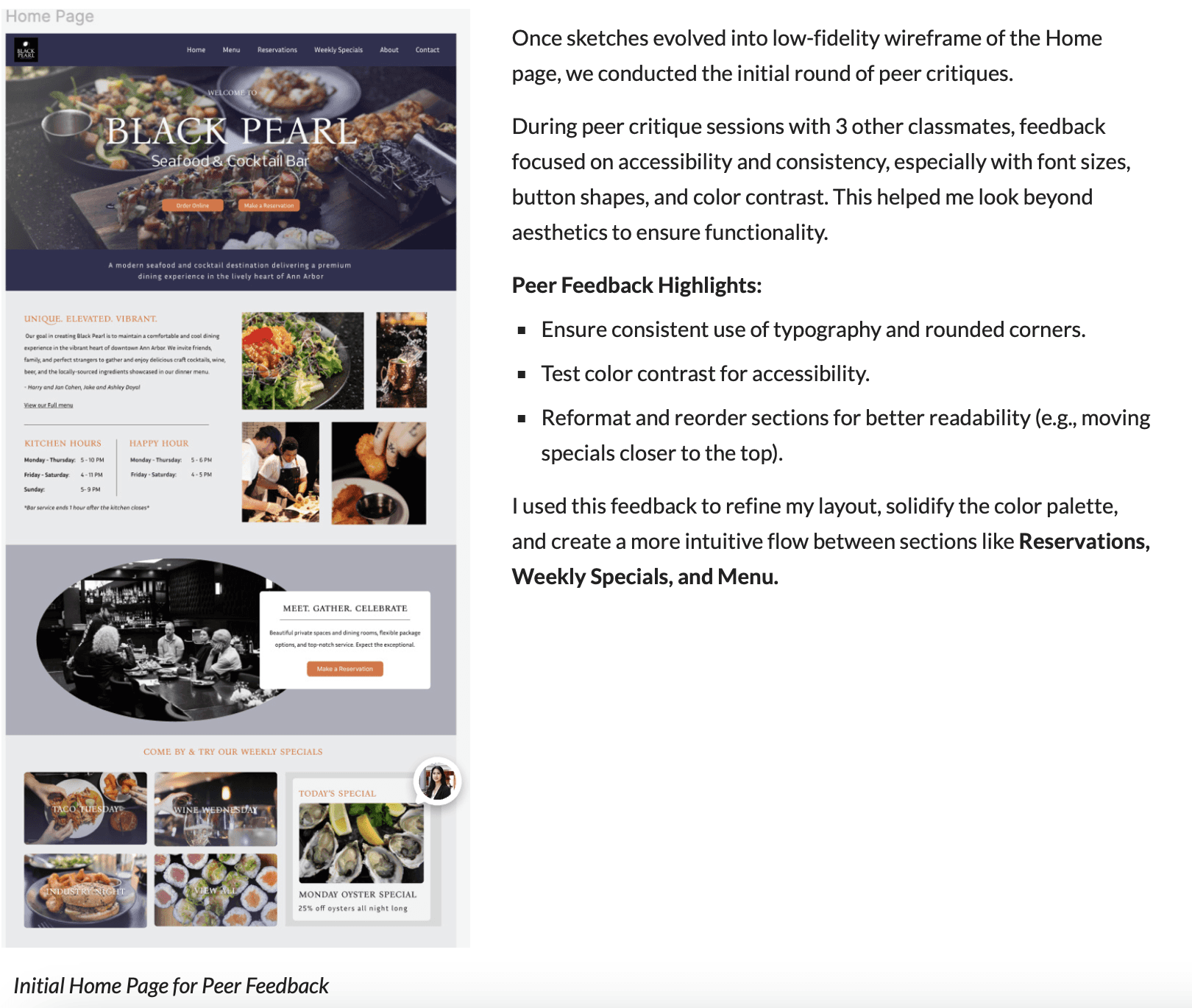
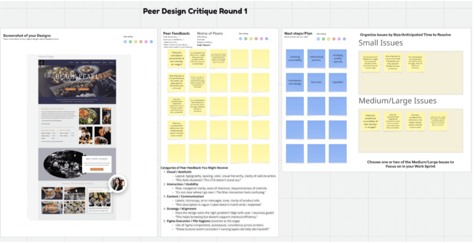
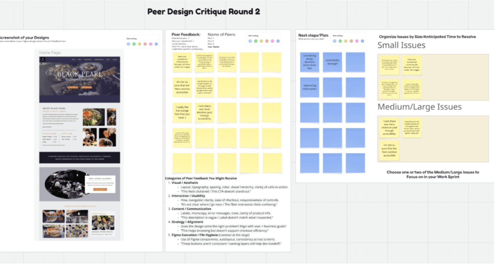
My peers appreciated the overall structure and modern feel of my redesign but pointed out areas where small adjustments could make a big difference. One recurring suggestion was to maintain visual and functional consistency, such as ensuring buttons had the same corner radius, that font weights were used intentionally, and that color contrast met accessibility standards. Another insight I received was about section hierarchy: for example, repositioning the “Weekly Specials” section closer to the top of the homepage, since users are often drawn to deals or seasonal highlights before reading through the rest of the site.
They also reminded me to think about responsive behavior, especially how spacing, text size, and call-to-action buttons would translate on mobile devices. This feedback helped me approach my design more systematically, balancing creativity with structure.
After class, I reviewed my Miro board notes and realized how valuable it was to see everyone’s unique approaches side by side. It reminded me that design isn’t just about what looks good, it’s about how effectively it serves user needs. I left the critique feeling more confident in my direction and motivated to refine details like font styles, spacing, and color contrast before moving into high-fidelity prototyping.
Visual Design & Prototyping
Transitioning to high-fidelity designs was challenging since I struggled to find the right balance between modern and inviting. However, once I established the color hierarchy and spacing, the design began to feel cohesive and reflective of Black Pearl’s ambiance.
I maintained a consistent visual language using muted backgrounds, vibrant accents, and elegant typography. The final prototype emphasized visual storytelling through full-width imagery, bold section headers, and a clean layout optimized for both desktop and mobile screens.
Design Opportunities
Redefine Brand Presence: How might we use visual storytelling and imagery to reflect Black Pearl’s elevated atmosphere and stand out from competitors?
Streamline Core Actions: How might we make reservations, ordering, and menu browsing effortless and intuitive, especially for users short on time?
Enhance Information Hierarchy: How might we organize and highlight key sections (menu, hours, contact, specials) so users can find what they need in seconds?
Integrate Descriptive and Inclusive Content: How might we ensure all users, including those with dietary needs, can understand menu details without confusion or extra effort?
Strengthen Mobile Responsiveness: How might we ensure the experience feels just as polished and accessible on smaller screens, maintaining clarity and brand impact?
Inital Prototypes for Home, Menu, Product Detail, Cart, Checkout, and Order Confirmation screens

Working on the prototyping phase was one of the most rewarding parts of this project because it allowed me to explore more of Figma’s interactive capabilities and refine my technical design skills. I enjoyed refreshing my understanding of how to create interactive buttons, color styles, and reusable components, which made the workflow much more efficient as the design evolved. Setting up consistent button states, hover effects, and transitions between pages helped me understand how even subtle microinteractions can enhance usability and make the experience feel smoother and more polished.
I also took time to refine color tokens and text styles, ensuring visual cohesion across all frames. Experimenting with layout grids and auto-layout helped me build a design that adapted seamlessly between desktop and mobile views. Overall, this process not only strengthened my prototyping skills but also deepened my confidence in using Figma as a storytelling tool, bridging the gap between design intention and user interaction.
Feedback & Iteration
Creating my first usability test was both exciting and nerve-wracking. I developed tasks simulating a real ordering process (e.g., ordering two Salmon Crudo dishes, selecting delivery, and adding a tip). Testing revealed valuable insights from 3 participants:
Key User Feedback:
Prototype felt “easy,” “modern,” and “refreshing.”
Clear progress bar and confirmation details built trust.
Users requested more visible spice levels, allergy labels, and food photos.
Confusion arose when terminology varied between “carryout,” “pickup,” and “delivery.”
I applied this feedback by:
Simplifying terms to just “Pickup” and “Delivery.”
Adding spice and dietary icons (GF, VV, V, *) to the menu.
Increasing image use for dishes and reducing whitespace for a compact, elegant feel.
Adjusting font styles and button sizes for accessibility.
Through these iterations, I realized how user testing transforms design assumptions into actionable insights, and how small adjustments can meaningfully improve the experience.
Key Insights
Visual Identity Drives Perception:
Users consistently associated design quality with restaurant quality.
The lack of strong branding, imagery, and cohesive color made Black Pearl feel outdated, creating a disconnect between its high-end dining experience and its digital presence.
Information Hierarchy Affects Trust:
Users struggled to quickly find essential information such as reservations, hours, and menus.
The reliance on centered text and minimal differentiation between sections caused cognitive fatigue and uncertainty about where to look first.
Content Depth Encourages Engagement:
Participants wanted richer content, such as food photos, spice indicators, and allergen or nutritional details.
These elements helped users visualize their experience and make informed decisions, which is especially important for health-conscious customers or those with dietary restrictions.
Visual Structure Builds Confidence:
Compact spacing, consistent alignment, and clear CTAs helped users feel oriented and in control.
A clutter-free yet visually rich layout made navigation intuitive and more enjoyable.
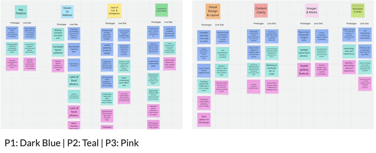
Following Usability Testing- Miro Board Mapping
Key Takeaways from Testing
Users consistently preferred the prototype’s clarity, organization, and visual hierarchy.
Visual elements like photos, dietary icons, and spice indicators built transparency and engagement.
Compact spacing and clear CTAs improved ease of scanning.
Including detailed confirmation summaries reassured users that their order was correct.
Small touches like accessible contact info added professionalism and confidence.
This was my first time conducting a usability test, and it was eye-opening to see how real users engaged with my design. Observing their reactions helped me understand how small choices like spacing, button placement, and terminology impact clarity and confidence.
The feedback guided meaningful refinements, from adding nutritional details to simplifying language and improving accessibility. Overall, the process taught me that great design isn’t just about how it looks, it’s about how naturally it works for others.
Reiteration of Prototype
Using my Miro board to organize insights from user testing, I grouped feedback into themes like navigation, content clarity, and visual hierarchy. Based on these patterns, I made several key refinements:
Improved information hierarchy – Moved key CTAs (like “Proceed to Checkout”) higher on the page to make primary actions more visible.
Standardized design elements – Adjusted button sizing, typography, and spacing for better consistency and readability.
Added food detail indicators – Introduced icons for spice levels, dietary preferences (GF, VV, V), and raw ingredients (*) to enhance clarity.
Refined checkout flow – Simplified the progress bar and improved layout for smoother navigation and easier order review.
Reorganized cart layout – Made pricing, item details, and editing options easier to scan and interact with.
Enhanced accessibility and contrast – Increased text and color contrast, refined spacing, and aligned components for visual balance.
Streamlined language – Simplified terminology (e.g., “Pickup” and “Delivery”) to reduce user confusion.
Final Prototype- Mobile & Desktop
Final Prototype Screens

Outcomes & Impact
The redesign created a cohesive and elevated online identity for Black Pearl that matches the sophistication of its dining experience.
Top Contributions:
Built a strong visual identity through cohesive color, typography, and imagery.
Reimagined the homepage storytelling to immediately communicate the restaurant’s personality and offerings.
Designed a traditional, easy-to-scan menu layout that encouraged engagement and improved clarity.
User Quotes:
“I absolutely love the first design so much—it was so easy and user friendly.”
“If I lived near this place, I’d order from it all the time because it’s so easy to use.”
Overall, usability testing confirmed that my redesign significantly improved clarity, trust, and overall satisfaction.
Reflection & Next Steps
This project pushed me to slow down and fully engage with every stage of the UX process, from research and ideation to usability testing and iteration. Unlike past projects, I followed the process end-to-end, which helped me connect each decision back to user needs and business goals. Conducting my first usability test was especially impactful; seeing real users navigate my design gave me a clearer understanding of how visual hierarchy, terminology, and layout choices affect their experience. It also showed me how important it is to design for accessibility and anticipate diverse user behaviors.
I also became more confident with Figma’s interactive tools, refining my ability to prototype realistic flows and maintain consistent color, text, and component systems. Through multiple iterations, I learned that thoughtful adjustments like adjusting spacing, improving contrast, or simplifying CTAs can make a major difference in usability and brand perception.
Next Steps:
Expand testing to test mobile users to ensure full responsiveness.
Continue refining accessibility features like text contrast, button sizing, and keyboard navigation.
Add microinteractions and motion cues to enhance engagement and storytelling.
Conduct follow-up usability tests to measure improvements and validate final iterations.
Ultimately, this project strengthened my confidence not only as a designer but as a problem-solver, reminding me that the best designs are shaped by iteration, empathy, and real user insight.