Triply: Travel Tool
Triply is an app that consolidates logistics, recommendations, and budgeting tools into one seamless platform
UI/UX

Project Overview
Client: The University of Vic (UVIC) | Design Thinking Study Abroad Program
Location: Barcelona, Spain
Timeline: 1 Week | May 2024
My Role: Lead UX Designer & Assistant UX Researcher
Team: Kally Van, Angel Nguyen, Nina Wang
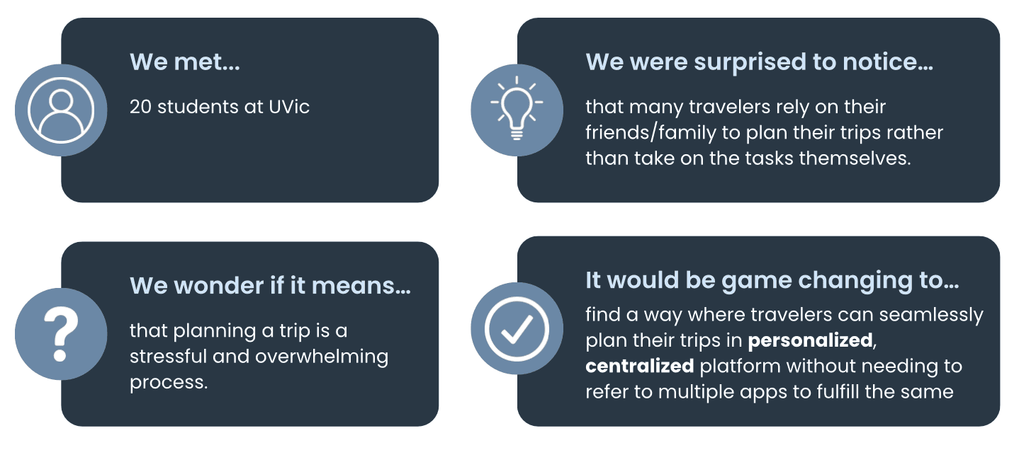
Travel planning is overwhelming and fragmented, forcing travelers to manage information and logistics across multiple platforms. We aim to simplify the travel planning process by creating a centralized app that consolidates logistics, recommendations, and budgeting tools into one seamless platform.
User Research
Participant Demographics
Total: 20 participants
10 participants living in Michigan, United States
10 participants living in Barcelona, Spain
Age: 18 - 31
Includes both female and male participants
Interview Questions:
Can you describe the steps you usually take when planning a trip?
How do you usually feel during the process of planning a trip?
What do you remember about the last time you organized travel for yourself or others?
Can you describe how much time or effort it usually takes to put together a trip?
What do you prioritize the most/ least when traveling
How do you make decisions about things like where to stay, how to get there, or what to do?
What helps you feel confident that you’ve made the right choices?
When you think about the planning process overall, is there anything that feels missing or could work better for you?
Can you tell me about any tools, websites, or services you use when traveling? What’s your experience with them?
If something could be improved about the way you plan trips, what would you want that improvement to look like?
Research Insights
Majority of interviewees said that one of the things they prioritize most are things to do on a trip most
Many of them said they use social media to find things to do, places to eat, etc.
Users mentioned they want a more straightforward, centralized system to organize everything.
Respondents said they think they made the right choice when they see reviews.
Respondents said they feel excited but also stressed when planning a trip.
Point of View
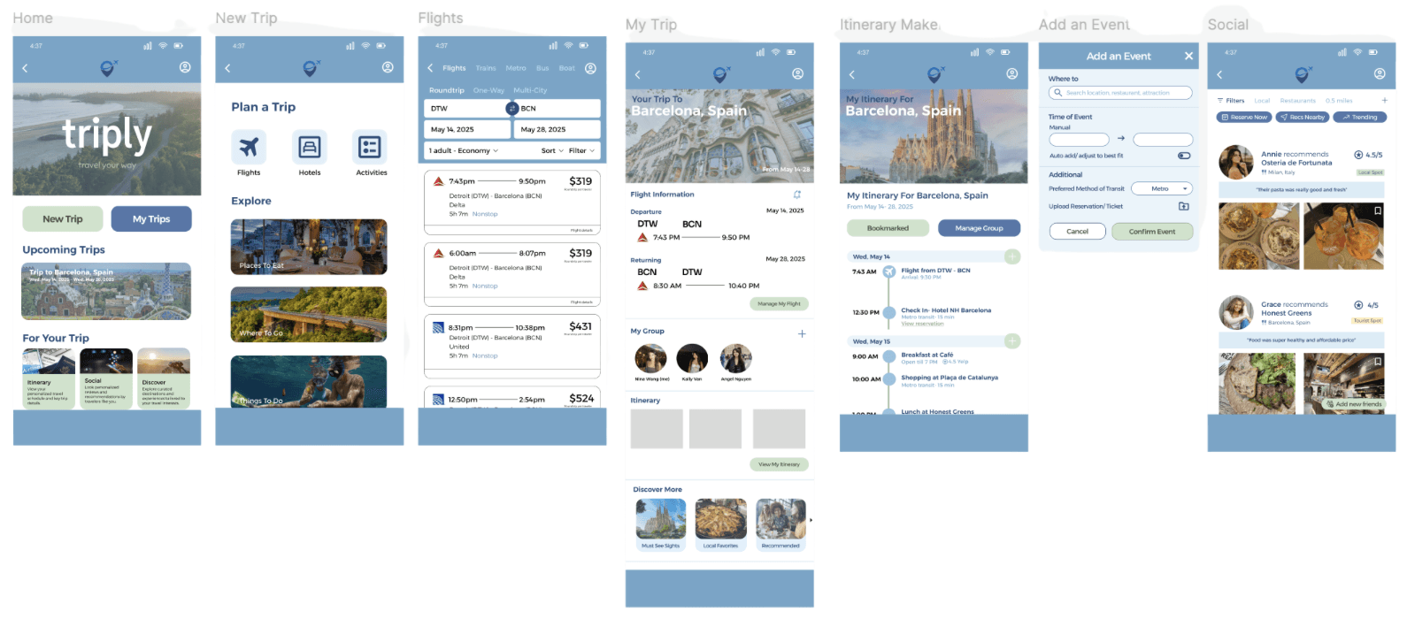
Mock-Ups
Usability Testing Insights
Participants mentioned if the the app uses real-time location or relies solely on user input to show nearby attractions
Mentioned that prototype should include filters that show cheaper prices of transportation
Our design should broaden accessibility (text size and colors, etc.)
Prototype should have reduced repetitive text
We should capitalize on our unique features to differentiate it from other traveling apps
With the social page, it can expand recommendations beyond just friends, include general public
Revised Prototypes | After Testing
